Above: Shell Café defines its seating area by lowering the lights with different lighting fixtures.
Today’s convenience stores are not the same stores you shopped at 20 years ago. Done right, they’re bright, airy and fresh with an intentional focus on customer experience at their core.
These stores, which have for decades capitalized on their major advantages—speed and convenience—are now focusing on being something more to consumers, zeroing in on how good design can impact every element of a store visit for an elevated experience.
“Design needs to serve a purpose to be effective and relevant—it should be a natural extension of the core values and personality of the individual retailer, create an open and easily understandable layout that is simple to navigate, project a strong first impression and provide a warm, welcoming environment,” said Joseph Bona, president of Bona Design Lab in New York City.
To be authentic, retailers need to find what it is that makes them different and then tell that story through their design. “Design is a strong tool to help [convenience stores] elevate their business,” Bona added.
And with freshly prepared food playing a more important—if not the most important—role in convenience stores, operators can take some design cues from quick service restaurants’ playbooks.
Write Your Foodservice Story
With foodservice now being the No. 1-selling category for c-stores, “layouts have evolved to help shape the food story retailers are trying to tell,” as a result, said Bona, adding that food prepping, staging and cooking areas should be more visible to emphasize freshness.
Retailers should decide what food narrative they’re trying to convey—if their specialty is made-to-order fried chicken in the store’s own proprietary breading, for example, then customers should be able to see that. This elevates a store’s story, especially when compared to some competitors, said Bona.
Design needs to serve a purpose to be effective and relevant.”
Seth Maddox, creative designer, King Retail Solutions in Eugene, Oregon, suggests creating direct sightlines back to the foodservice area, especially if it has an open kitchen, so customers can be enticed to buy food.
The more retailers can showcase the freshness of the food or elevate the offerings through presentation, the better, and there are small design touches that can have a big impact—displaying pastries or bread items in baskets, which add color and texture and make the products seem fresher, more akin to a bakery, for example; or showing sandwiches being prepared, even if the meat comes in already sliced.
Technology Upgrade
Technology is becoming a more important marketing tool. Retailers are using digital menu boards with dynamic images to whet customers’ appetites, such as steam rising from a coffee cup or condensation dripping down a cold drink. These vibrant images create color and movement and capture more eyeballs than static signage.
Kwik Trip stores, for example, typically have around 18 digital signs in their 9,000-square-foot stores. These are used to promote everything from counter items to smoothies and fresh foods and can be quickly and easily changed for new offers or to reflect pricing changes or promotions. Ideally, retailers should use digital menu boards to promote high-profit and high-margin items and specials.
This Jacksons location, designed by King Retail Solutions, uses sign hierarchy that denotes products and category sections to help customers navigate the store.
Transparent LED digital signage is also being used more. This can be placed on cooler doors or front windows and is easily updated with time-of-day specials since the film is connected to a server.
Digital ordering kiosks are becoming more prevalent, both in the convenience industry and in quick serve restaurants. Kiosks are ideal for customers who prefer not to interact with staff and should be placed within the foodservice area so it’s obvious what can be ordered there.
And in the back of house, kitchen display systems (KDS) help guide employees through the steps for making food items, which can be extremely helpful for locations with high turnover because less staff training is required.
Using technology can also help with consumer perceptions of the store, making the space feel less cluttered, sleeker and more modern, said Bona, “and it makes people feel a little more confident that these are modern facilities.”
An Eclectic Mart in L.A.
Fatty Mart in Los Angeles is firmly embedded in its community.
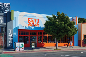
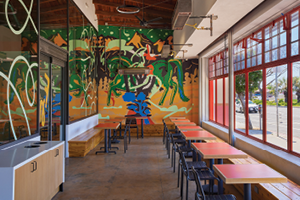
The store opened last year and features a variety of unusual foods befitting the diverse neighborhood it’s in. It also features freshly made pizza, banh mi and coffee around the perimeter of the space, which is all viewable by shoppers. There’s also a robust grab-and-go offering and consumers can see it all being freshly prepared—including a view of the pizza oven.
Outside, the store is painted vibrant orange and blue, colors that continue inside. Los Angeles firm Design, Bitches, retained the original storefront but removed the glass from the windows, then built a secondary storefront 25 feet back, creating a covered seating area in between the two. “This really creates activity and helps pull people into the space,” said Catherine Johnson, founding partner, Design, Bitches.
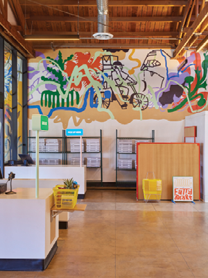
The space is open and airy with low shelving and high, exposed ceilings. There’s lots of warm laminated plywood, while tile makes the space feel upscale, clean and fresh. Fatty Mart features bright and fun murals in the brand colors. Guests can shop in the store or order ahead and pick up from a designated spot just inside the front door.
Technology is making its way into more consumer touchpoints too, such as coffee or slushie machines. This eliminates the need for an employee preparing these drinks, said Maddox, as well as taking the order, since it’s often done through a kiosk.
Wayfinding is Paramount
Digital ordering, and the pickup of those meals, has changed the layout of c-stores and QSRs, and clear directional signage is ever more important. “There’s such a variation with customer journeys,” said Lauren Chipman, principal and CEO, Chipman Design Architecture in Des Plaines, Illinois, “so we need to be very obvious. The customer needs to know where they’re going for mobile pickup, drive-thru or ordered ahead drive-thru, or catering.”
Chipman has designed several quick service restaurants, and said it’s a good idea to think of signage in a hierarchy because there’s a lot for customers to take in.
Maddox is also a fan of signage hierarchy, with tier one directing people to certain areas of the store—food to order, the cold vault, restrooms or snacks, for example. This could be done with printed signs, canopies, clouds and hanging signs. In tier two are eye-level signs, such as ones showing where specific beverages are or directions for how to make a cup of coffee; and tier three gives product level information such as pricing.
At a Bellevue, Washington, Evergreens location, a railing subtly guides customers through a clear ordering path and demarcates sections of the restaurant.
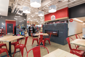 King Retail Solutions added a distinct seating area, separated by a homey fireplace divider, to this Jacksons location for customers to enjoy their food, work remotely or take a break from the road.
But try not to overwhelm the customer with signage, Chipman said. She likes to use hanging signage, because it can be flexible, though it is harder to update regularly. Conversely, she’s not a fan of floor signage as it’s reminiscent of the pandemic (remember those six feet apart circles directing customers where to stand?). “It feels like the [place] hasn’t been updated,” she explained.
Wayfinding also doesn’t only include directional signage—it can be accomplished with cues or guidance that leads customers through a clear path. For example, retailers can demarcate different areas with colored flooring or a different style of flooring—perhaps in the foodservice or payment area—to help customers distinguish sections of the store.
Maddox likes to define the seating area by lowering the lights or adding different lighting fixtures, and creating a canopy or cloud over the tables to make a zone.
At a recently opened Bellevue, Washington, Evergreens location (a Seattle-based quick-service chain), Joy Dayaw, associate, MG2 Design in Seattle, included a railing six feet from the front door to guide customers to the menu, the ordering line, and then to the POS, “so it’s a very clear pathway.” And the railing, of course, fits in—it’s painted the dark, deep green of the Evergreen’s palette. It’s subtle, but the railing separates the ordering line from the seating area and from customers picking up orders.
Other wayfinding can be incorporated at eye level and above, and is often suspended from the ceiling. “Wayfinding signage is critical now because consumers want that streamlined experience,” said Dayaw. “We’re really focusing on the speed and convenience of the customer flow.”
“Wayfinding signage is critical now because consumers want that streamlined experience.”
Embrace Community
Incorporating the local community into the store design is key, said Maddox. This helps retailers connect with consumers living nearby, but also makes the store more interesting to tourists and others passing through. This can be as simple as presenting imagery of local landmarks, even with small nods in graphics and signage. Retailers should also consider incorporating local materials—if you’re in an area with lots of stone or wood, for example, use those in your store design, Maddox said.
Chipman also likes to include local maps, which “are something everyone identifies with,” she said. Other elements to focus on are famous locals or the history of the area—maybe it was known for a certain industry like clockmaking.
Murals work well for localizing c-stores and restaurants because they’re low cost and can be refreshed, and brands can commission local artists, Chipman pointed out. Murals can be painted directly onto a wall or printed and applied to the wall. While more expensive upfront, the latter option tends to weather well; if outside it will fade less, and inside it can be wiped down as needed.
At the Smashburger in Queens, New York, a wall graphic depicts nearby Flushing Meadows Corona Park, site of the 1964 World’s Fair and home to other local attractions.
Dayaw recently worked with Smashburger and a vendor to create expansive graphic wall coverings for the QSR featuring brand colors and images of nearby landmarks.
“It’s a great tool to use in QSR designs because it gets so much impact for the amount of effort you put in,” she said. And the more these images incorporate brand colors, she added, the more cohesiveness there is from one location to another.
Sit and Stay
Including a seating area for customers to enjoy their food “helps contribute to the story of [your store] being a food destination,” said Bona.
Seating areas tend to be small, said Maddox, with maybe four tables able to seat around 10 people total. “Even if it doesn’t get used, it can just make the customer perceive it as a space they want to sit in, and it can reinforce that brand message of cleanliness and freshness,” he said.
Eye level signage, such as these displays used by Power Market and designed by King Retail Solutions, help direct customers to specific items.
And he expects to see more seating areas and even lounges with soft seating as gas stations add chargers for EV drivers. He’s allocating more space for these in his designs now, sometimes even adding features like fireplaces.
These seating spaces can also be designated as places for customers to wait for their food or their mobile order to be ready to be picked up, Maddox pointed out.
Whether a retailer is tweaking its store design or building a brand new store, a little forethought about the customers’ experiences and perceptions could go a long way in ensuring those shoppers become repeat visitors.
Bite-Sized Design Ideas
Consider adding a self checkout near your regular checkout to provide options. Stores need at least one of each, said Maddox.
Upgrade your interior materials to upscale the customer experience. In six out of 10 projects, Maddox is asked to make the convenience store “not feel like a gas station.” He’s using higher-quality materials, like real tile, actual wood cladding and more expensive light fixtures “so it feels more authentic,” he said.
Let customers see into your kitchens to showcase the freshness of your food program. QSRs are doing this too. Smashburger wanted customers to literally see employees smashing their burgers, so Dayaw designed an open area where people could sit and wait for their food while watching the cooks. “They feel they’re part of that experience,” she said.
Include a mobile order pickup spot for customer convenience. David Shove-Brown, partner at architecture firm //3877 in Washington, D.C., suggested having pickup windows so some customers don’t even have to enter the restaurant. These should be facing out from the kitchen and ideally near the expo station, he said, otherwise an employee has to sit at the window full-time. Pickup windows work particularly well in densely populated areas due to the large quantity of orders, he said.